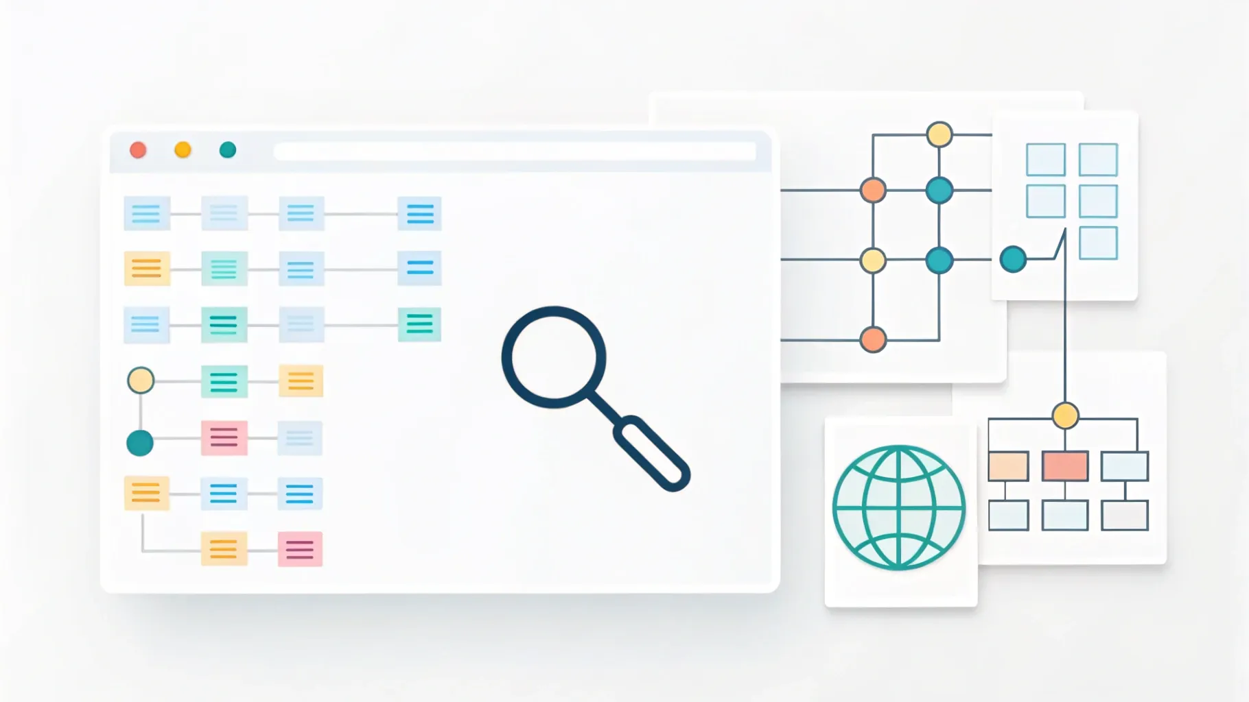
I built a small, focused search app that explains AI topics in plain language using Gemini 3 and the AI Studio ecosystem. My goal was simple: make complex ideas feel approachable. Instead of producing another generic chatbot, I biased the app generation pipeline to favor the Gemini API, wired it to web lookup, and let the model generate a tight search UI that’s tailored for teaching. What emerged was a lightweight, interactive experience that turns dense technical concepts into friendly analogies and visuals.
Table of Contents
- Why build educational apps with Gemini 3? 📚
- How I built the educational search UI 🛠️
- Explaining Transformers in plain language 🤖
- Why analogies matter in technical explanations 🔍
- Bringing mundane things to life visually 🎨
- Design patterns for effective educational apps ⚙️
- Limitations, safety, and trust 🛡️
- Examples I built and why they work ✨
- A short how-to: create your own educational search tool with Gemini 3 📝
- Prompt examples that worked well 🧭
- How visuals and interactivity improve retention 🎯
- Building for different audiences: students, developers, and curious minds 🧑🏫
- Measuring success and iterating 📈
- Future directions I’m excited about 🚀
- Quick checklist before you ship ✅
- FAQ ❓
- Final thoughts
Why build educational apps with Gemini 3? 📚
There’s a big gap between cutting-edge AI research and how most people learn about it. Dense papers, jargon-filled blog posts, and terse documentation all make learning harder than it needs to be. I wanted to see whether a toolchain that combines a large foundation model with a few UI rules could bridge that gap.
Gemini 3 gives you the raw conversational and reasoning capabilities. AI Studio supplies the scaffolding to generate apps fast. Together they let you:
- Create domain-specific experiences that feel curated rather than generic.
- Surface simple analogies and explanations that map complex mechanisms to everyday situations.
- Combine retrieval from the web with the model’s generative strengths so explanations are grounded in up-to-date sources.
- Spin up visual, interactive elements that transform boring data—like receipts and floor plans—into engaging learning moments.
In short, this combo is ideal when the goal is education rather than just conversation. You get the fluency of a large model plus the ability to design a clear, guided user experience.
How I built the educational search UI 🛠️
I started by asking the system to generate an app whose job is to explain AI topics in layman’s terms. That prompt alone unlocked a lot. The generated app included a search box, a results area, and a small panel that explained each result using plain language analogies. It also added a step to look up the web, so answers could be cross-checked against recent sources.
The magic here is twofold. First, biasing app generation towards the Gemini API means the app is smart by default. The UI is designed to make the model’s output useful rather than merely conversational. Second, enabling web lookup means the model can ground its explanations in current material rather than relying solely on static knowledge.
The flow I used looks like this:
- Define the domain: Focus the app on AI concepts and their simple explanations.
- Prompt the generator: Ask the generator to produce a search UI that returns short, plain-language explanations and analogies.
- Enable retrieval: Allow web lookups for supporting citations and the latest developments.
- Shape the UI: Provide a search bar, a primary answer pane, and toggleable details that dive into technical depth.
- Iterate: Test with a handful of queries and refine prompts until the responses hit the right tone and accuracy.
The result is a focused tool that feels less like a generic assistant and more like a compact reference built for people who want to understand quickly.
Explaining Transformers in plain language 🤖
One of the first things I asked the app to explain was transformers. I wanted a layman analogy that wouldn’t scare people off with equations. What I got back was something I still like: imagine a lively group discussion.
Picture a room where everyone is talking at once. In older models you might have had a single listener who could only pay attention to one speaker at a time. That listener misses a lot of context because it treats the conversation as a strict sequence of statements.
A transformer, on the other hand, behaves like a very flexible listener. It doesn’t have to focus on one person at a time. Instead, it can dynamically decide which people matter most for understanding any given sentence. For each idea someone expresses, the listener looks around and asks: whose words matter most to making sense of this?
Concretely this is the attention mechanism. Every word in a sentence checks in with every other word and decides how much it should influence the current interpretation. That makes it possible to capture long-range relationships and subtle dependencies—things that rigid sequential listeners struggle with.
Breaking that down further:
- Tokens as participants: Think of words or subword units as people in the room.
- Attention as selective listening: Each token chooses how much attention to pay to every other token.
- Multiple heads: The listener can split attention into multiple specialized perspectives, like listening for tone, for core facts, or for relations.
- Position signals: The model still knows the order of the conversation, but it treats that as one piece of information among many.
That analogy helps nontechnical learners grasp why transformers were so disruptive: they allow models to be context-aware and flexible, which translates into better translation, summarization, and generation capabilities.
Why analogies matter in technical explanations 🔍
Analogies are not just sugar-coating. They are cognitive tools that let people map new structures onto existing mental models. When I ask the app to produce an analogy, I expect it to:
- Anchor a difficult concept to everyday experience.
- Preserve the essence of the mechanism without oversimplifying to the point of being wrong.
- Provide a pathway to the next level of detail for curious learners.
The transformer-as-a-listener analogy ticks those boxes. It explains behaviorally why attention helps and how multiple attention heads create distinct perspectives. From that anchor, you can then introduce more precise vocabulary like "self-attention," "query," "key," and "value" without losing the learner.
Bringing mundane things to life visually 🎨
One of my favorite experiments was applying the same idea to objects people usually find boring—like receipts. The app can take a plain receipt and automatically build a visual, interactive narrative around it. It highlights categories of spending, creates timelines, and even imagines what a purchase might look like in context.
For a floor plan, the system can go further: it can create a small, explorable view of a home, label rooms with probable functions based on square footage, and suggest layout tweaks. These visualizations make the information tangible.
Why does this matter for education? Because visuals drive comprehension. When you pair a solid plain-language explanation with a simple visualization, learners can connect abstract concepts to concrete experiences.
Design patterns for effective educational apps ⚙️
Over the course of prototyping, I spotted a few repeatable patterns that make these apps effective.
Focus on a single problem space
Narrowing the domain reduces confusion. An app that only explains AI primitives—like transformers, attention, and embeddings—can be far more consistent than one that tries to do everything.
Provide layered explanations
Most learners don’t want full technical depth right away. Offer:
- Quick analogies: One-sentence or one-paragraph simplified views.
- Short technical summaries: Two to four sentences with basic terms.
- Deep dives: Links or toggles to deeper material and citations.
Use retrieval for grounding and citations
Web lookup helps ensure the answers stay current. If the app returns a complex claim, it should also show where that claim came from. That builds trust and lets learners verify the reasoning themselves.
Design the UI for quick wins
A clean search bar, a highlighted explanation, and a "Why this matters" snippet encourage engagement. Interactive visuals and short examples help retention.
Tune the tone
For educational apps, tone matters a lot. I biased the generator toward conversational, reassuring language. Keep sentences short. Avoid jargon unless you immediately define it.
Limitations, safety, and trust 🛡️
There are real limits and risks that come with leaning on generative models for education. Hallucinations still occur. Models can produce plausible-sounding but incorrect explanations. That’s why I built retrieval and citation into the workflow.
Here are practical safeguards I use:
- Retrieval-first responses: When the model makes factual claims, surface a citation or a short list of sources.
- Uncertainty signaling: If the model is unsure, have it say so explicitly and offer pointers for where to look next.
- Human review for high-stakes content: For topics where accuracy is critical, require an expert-in-the-loop before publishing.
- Rate-limit ambiguous content: If a prompt is vague, ask clarifying questions rather than guessing.
Transparency builds trust. When an explanation is clearly labeled as a simplified analogy and paired with references, learners can use it as a springboard rather than a final authority.
Examples I built and why they work ✨
I experimented with a few prototypes that made it obvious how this approach scales. Here are the ones that stood out.
AI explainer search
A compact search interface that returns short analogies and an expandable technical section. It’s perfect for quick comprehension and for people who then want to drill deeper. The UI favors one clear answer and then lets users expand for nuance.
Floor plan visualizer
This takes a set of room dimensions or a sketch and automatically generates an annotated visual. It suggests functional uses and possible improvements. The combination of text plus visuals helps learners understand spatial relationships better than a flat description.
Receipt storytelling
A boring receipt becomes a little story. The app highlights categories, shows spending trends, and suggests ways the purchase could be optimized. That turns an otherwise tedious task into a learning moment about budgeting and categorization.
Micro-course builder
For a given concept, the app can assemble a sequence of short explanations, example problems, and visuals. The micro-course is tailored to the user’s level—novice, intermediate, or advanced—and gives immediate practice items.
These examples show how the same foundation—short, plain explanations plus interactive visuals—can be adapted to many learning scenarios.
A short how-to: create your own educational search tool with Gemini 3 📝
If you want to try building something similar, this is the recipe I followed. It’s intentionally pragmatic.
- Pick a narrow domain: Start with one topic area like "AI fundamentals" or "machine learning primitives."
- Define user intent: Are users looking for quick analogies, step-by-step tutorials, or source-backed summaries?
- Create prompt templates: Write prompts that instruct the model to produce a short analogy, a one-paragraph technical summary, and a list of citations. For example: "Explain X in plain language using a single everyday analogy. Then provide a two-sentence technical summary and up to three sources."
- Enable retrieval: Turn on web lookup so the answers can cite current material. Use a lightweight retriever to surface relevant documents before generation.
- Design the UI: Keep it minimal. A search box, a highlight panel for the main answer, and a collapsible "Read more" section work well.
- Test with real queries: Try both naive and edge-case questions to see how the app responds. Note where hallucinations or vagueness appear.
- Iterate with feedback: Add clarifying prompts or guardrails where necessary. Consider collecting user feedback so the model can be re-tuned for tone and accuracy.
- Add human-in-the-loop for sensitive topics: Where facts matter, add a review step before publishing answers.
The goal is to ship something that teaches well and is easy to trust. That usually means conservative claims, clear sourcing, and compact, digestible explanations.
Prompt examples that worked well 🧭
Here are a few prompt patterns that helped produce consistent, high-quality output.
- Analogy-first: "Explain [topic] using a single, everyday analogy. Keep the analogy under two sentences, then provide a one-paragraph technical summary."
- Layered depth: "Give a one-sentence simple description, a two-sentence technical summary, and a bullet list of 3-5 follow-up resources."
- Teach-and-test: "Explain [topic] in simple terms, then give a two-question quiz to test understanding."
Those templates yield consistent formats that users can quickly internalize. Knowing what kind of response to expect makes the tool feel reliable.
How visuals and interactivity improve retention 🎯
Visuals convert abstract text into spatial or temporal representations that are easier to remember. When combined with interactive elements—like toggling levels of detail or manipulating a simple diagram—you get active learning moments.
For example, the receipt visualizer highlights categories and then lets the user filter by date or merchant. That filtering is a small interaction, but it engages the learner in analyzing the data rather than passively reading it.
Similarly, a transformer explainer that animates how attention weights move between words gives an intuition that static text alone cannot.
Building for different audiences: students, developers, and curious minds 🧑🏫
Different audiences need different things. Students want structure and practice. Developers want concise definitions and code examples. Curious learners want one-sentence clarity and a chance to explore further. Design choices should reflect these differences.
- Students: Add practice items, quizzes, and progress tracking.
- Developers: Provide short code snippets, links to libraries, and reproducible examples.
- Curious learners: Give short analogies, quick links to deeper reads, and optional visuals.
When you know your audience, it is easier to bias the generator toward the right tone and depth.
Measuring success and iterating 📈
Educational apps need different metrics than general-purpose chatbots. Focus on:
- Comprehension gains: Small quizzes or before-and-after checks to see if explanations improved understanding.
- Engagement with deeper content: How often do users click "Read more" or view citations?
- User trust signals: Feedback like "This was helpful" or "I want more detail" helps refine tone.
Use the metrics to refine prompts, tune retrieval, and add or remove UI affordances until the app consistently helps people learn.
Future directions I’m excited about 🚀
A few directions feel especially promising for educational experiences:
- Adaptive micro-courses: Systems that tailor explanations and practice to each learner’s pace and prior knowledge.
- Multimodal explanations: Combining text, visuals, and audio so learners get the explanation in the format that suits them best.
- Collaborative learning modes: Small-group features where learners can discuss a model’s analogy and correct it collectively.
- Interactive simulations: Tiny sandboxes where learners can tweak model parameters and immediately see the effect.
These build on the simple principle I used: keep the explanation short and honest, offer a clear next step, and make the learning experience interactive when it adds value.
Quick checklist before you ship ✅
Before releasing an educational search app, run through this checklist:
- Domain scope is clear and narrow.
- Responses include simple analogies plus citations when factual claims are present.
- Tone is consistent and friendly.
- Visuals are optional but helpful for comprehension.
- Uncertainty is signaled explicitly when applicable.
- Human review is required for high-stakes or sensitive topics.
FAQ ❓
What is Gemini 3 and how does it differ from previous models?
Gemini 3 is a large multimodal foundation model designed for fluent reasoning and generation across text and other modalities. Compared to previous iterations, it typically offers improved contextual understanding, better compositional reasoning, and more reliable responses when combined with retrieval. In practice, this means it is easier to bias toward useful educational outputs when used in app generation workflows.
What is AI Studio and why use it?
AI Studio is a development environment and app generator that helps you build AI-powered applications quickly. It integrates model access, UI generation, and optional retrieval, so you can focus on shaping the educational experience rather than wiring infrastructure. It also makes it straightforward to bias the generated apps to use Gemini APIs for smarter outputs.
Can these educational apps replace teachers?
No. These apps are tools that supplement teaching. They excel at delivering quick explanations, analogies, and interactive visuals, but they lack the human judgment, empathy, and long-term mentorship that teachers provide. The best use cases involve augmenting instruction and freeing educators to focus on higher-level guidance.
How do I reduce hallucinations in the app?
Use retrieval and require the model to cite sources for factual claims. Add uncertainty signals where appropriate, and involve human review for sensitive content. Conservative prompt templates that ask the model to qualify its certainty and provide sources work well.
Is user data private and secure?
Data privacy depends on how you configure your backend and the data policies of the model provider. Design the app to avoid unnecessary data collection, use secure channels for transmission, and follow best practices for storing and accessing logs. If users are uploading personal documents, make sure to disclose how those files will be handled and to enable deletion options.
What makes a good analogy for teaching technical topics?
A good analogy maps an unfamiliar structure to a familiar one while preserving the key relationships. It should be concise, avoid introducing new technical complexity, and point learners to what the analogy omits. Follow the analogy with a short technical summary to bridge into deeper material.
How important are visuals in these apps?
Visuals significantly improve comprehension for many learners. Even simple diagrams or annotated examples can transform a concept from abstract to concrete. Visuals are especially valuable when paired with a short textual analogy or explanation.
Can I connect external APIs or databases to the app?
Yes. Integrating external APIs or domain-specific databases is often essential for grounding responses and providing accurate, up-to-date citations. Use a retriever to surface relevant documents before generating the final explanation.
What are the best prompt structures for consistent output?
Templates that standardize output work well. For example: 1) a one-sentence everyday analogy, 2) a two-sentence technical summary, and 3) up to three sources. Consistent structure helps users know what to expect and makes it easier to parse and display results.
Final thoughts
Building an educational search tool with Gemini 3 and AI Studio reminded me how powerful small design choices are. A focused domain, concise analogies, layered explanations, and a pinch of visual interactivity produce educational experiences that feel friendly and useful.
The combination of a capable model plus a guided UI lets me turn dry content—like receipts or complicated AI concepts—into moments where people actually learn something. The main trick is to keep explanations honest, provide citations when you can, and design interactions that invite curiosity rather than overwhelm it.
If you want to try this yourself, start narrow, shape the tone, and require the model to back up facts. You’ll be surprised by how much clarity a single well-crafted analogy can bring.


