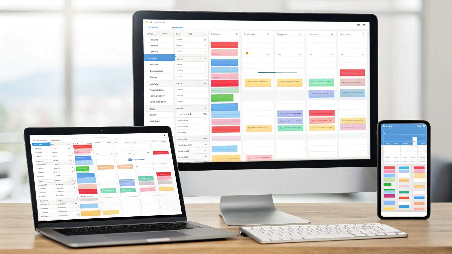
In a recent tutorial I published with Canva, I walked readers and viewers through a complete wrap-up of the campaign workflow: plan your content, automate publishing, and measure outcomes with clear analytics. As someone who builds and runs campaigns every week, I reported the tools, steps, and best practices we use to make multi-channel campaigns predictable, repeatable, and measurable.
This article reads like a newsroom dispatch and a how-to combined — it’s practical, actionable, and written from my point of view. I'll take you step-by-step through the Content Planner, scheduling tactics, cross-platform customization with Magic Resize, approval flows for teams, advanced analytics, live dashboards with Data Connectors, and collaboration practices that keep everyone aligned. Along the way I'll share tips, examples, and troubleshooting advice so you can put these tools into practice immediately.
Whether you’re a solo marketer or managing a five-person creative team, you’ll find checklists, templates, and clear instructions that reflect the way I actually run campaigns. Let’s get into it.
Table of Contents
- Quick overview: What this report covers 📰
- The news lead: Why content scheduling and tracking matter now 🔎
- Content Planner: your single calendar to rule campaigns 📅
- Scheduling across channels and customizing content 🕒
- Approval flows and team coordination ✅
- Insights and analytics: what I track and why 📊
- Data Connector: automate reporting and build live dashboards 🔗
- Turning raw numbers into actionable insights 🧭
- Collaboration: keep the campaign team coordinated 🤝
- Practical workflow: from planning to reporting in one week 🛠️
- Case study: a mini campaign example 📈
- Common pitfalls and how I avoid them ⚠️
- Measurement maturity: what to aim for next 📈
- Tools checklist: what I have open during a campaign 🔧
- How I brief stakeholders and present results 🗣️
- Security, permissions, and governance 🔐
- Final thoughts: put data at the heart of your creative process ❤️
- FAQ ❓
Quick overview: What this report covers 📰
- Why planning and scheduling are mission-critical for consistent campaigns
- How to use the Content Planner to coordinate posts across social, email, websites, and print
- How to customize a single design for multiple channels with Magic Resize
- How to use approval workflows to keep stakeholders happy and campaigns on schedule
- How to read and act on analytics inside the platform — from impressions to engagement
- How to build live dashboards with Data Connectors (Google Sheets, Google Analytics, Salesforce) to automate reporting
- Collaboration and organization techniques that scale: folders, tags, comments, and task assignment
The news lead: Why content scheduling and tracking matter now 🔎
Campaigns used to be simpler: one poster, one flyer, one channel. Today’s communications run across social, email, web, sometimes print, and often rely on multiple creative variants. In that landscape, I found that planning and scheduling are no longer optional — they’re the backbone of predictable performance.
Here’s the headline I want you to remember: well-planned campaigns save time, reduce risk, and make your results defensible. When you can point to a schedule, show a version history, and pull live data, you make better decisions and keep stakeholders calmer. In short: you increase the odds that creative work will turn into measurable outcomes.
Content Planner: your single calendar to rule campaigns 📅
When I start a campaign, I open the calendar first. The Content Planner acts as a unified view of everything scheduled — social posts, email sends, website pushes, even print jobs. Imagine a single calendar where you can see what’s scheduled on Monday, what’s going live mid-week, and which assets are waiting approval. That’s what I built my process around.
How I use the Content Planner:
- I connect relevant social accounts (Instagram, Facebook, LinkedIn) so posts appear in one place.
- I create a campaign series in advance: launch, teaser, reminder, and follow-up. Each post gets its own calendar entry.
- I assign owners and set approval requests right from the calendar so nothing goes live without sign-off.
- I duplicate entries for recurring posts and then tweak captions or images as needed.
Scheduling basics — step-by-step
Scheduling in the planner is straightforward — and that’s by design. I pick a date, select the design, choose channels, add a caption, and tap schedule. But the nuance comes from how you prepare your designs and captions in advance so the act of scheduling becomes almost ritualistic and fast.
Here’s my step list:
- Map the campaign timeline: pick launch date, major milestones, and pulse points.
- Prepare a content list: each piece of content gets a purpose (awareness, consideration, conversion).
- Create designs with reusable templates and brand assets.
- Draft captions and tagging strategy for each platform.
- Use the Content Planner to place each post on the calendar and select channels.
- Attach the design pages you want to share (multi-page designs can be published page-by-page).
- Request approval and confirm the owner before scheduling.
Tip: Keep sequencing obvious
For a series, I give each calendar entry a clear name: “Launch: hero post — IG/Facebook,” “Launch: hero post — LinkedIn (long form),” “Launch: reminder — email.” Naming conventions prevent confusion, especially when multiple people review the calendar.
Scheduling across channels and customizing content 🕒
It’s tempting to treat every post as a one-size-fits-all asset, but platform context matters. I schedule a single post to multiple channels when the message is identical, and I customize when the audience or format shifts.
When I want to reach audiences on several platforms at once, I schedule a single post to multiple connected channels with just a few clicks. If I need to tailor that post for each platform, Magic Resize is my go-to tool.
Magic Resize: one design, many channels
Magic Resize saves me hours. I design in one aspect ratio and then generate platform-specific versions automatically: square for Instagram, vertical for Stories, horizontal for LinkedIn or Facebook feed images, and the sizes I need for ad platforms. This keeps visual identity consistent while matching platform best practices.
My workflow with Magic Resize:
- Create the primary design that captures the campaign idea.
- Use Magic Resize to generate versions for each platform.
- Review each resized asset quickly to tweak copy placement or imagery.
- Schedule the appropriate asset to each platform from the Content Planner.
Multi-page design publishing
If a design has multiple pages — say a carousel or multi-card ad set — I select which page to share with each scheduled post. That means I can reuse a single design file and publish a different page as the hero image for each platform, keeping everything centralized and version-controlled.
Approval flows and team coordination ✅
Scaling campaigns without approvals is risky. I rely on the Content Planner’s Request Approval feature for scheduled posts, and I use comments and task assignments inside designs to guide the creative process.
Here’s how I keep teams aligned:
- I invite team members and set permissions for what they can edit or view.
- I organize assets in folders and add tags so people can find what they need fast.
- For each scheduled post, I use Request Approval to create a formal checkpoint before publishing.
- I assign tasks in comment threads so responsibilities are explicit — e.g., “@Jordan: please add alt text for accessibility by Thursday.”
Organizing with tags and folders
Projects multiply quickly. I create a folder per campaign and drag-and-drop designs into it. I also add tags (example: #Q4launch, #hero, #email) which makes searches and bulk actions easier. These small organizational standards shrink the time spent hunting for assets and reduce duplicated effort.
A practical approval workflow
- Design created and tagged; draft caption attached.
- Design routed to reviewer with a specified deadline for feedback.
- Revision loop occurs inside the design via comments; all feedback is resolved in-line.
- Approver hits “Approve”; scheduled post moves to “ready to publish.”
- At publish time, platform scheduling executes automatically.
Insights and analytics: what I track and why 📊
Scheduling is just the beginning — to scale effectively, I need to know what’s working and what’s not. That’s why I built an analytics-first approach and taught it in the tutorial.
Open the Insights tab on any shared design — whether it’s a presentation, website, doc, or social post — and you’ll see the metrics that matter: unique viewers, total visits, engagement from polls and quizzes, average time per page, and your most popular pages. For social posts, the platform shows impressions, clicks, reactions, shares, and comments.
Core metrics and how I interpret them
- Impressions: How many times your post showed up in users’ feeds. Useful for reach and awareness.
- Clicks: The number of people who took action — good proxy for interest and CTA effectiveness.
- Engagement (likes/shares/comments): Measures resonance and content quality. Shares often predict organic reach growth.
- Unique viewers / total visits: Use this for docs and websites to understand how many individuals are reaching your content vs repeat visits.
- Average time per page: Tells you whether people are reading or bouncing quickly. Long dwell times often correlate with quality content or interactive elements.
- Top pages / top-clicked links: Helps prioritize what to optimize and what to repurpose.
Drilling down for websites
For websites specifically, I look at traffic sources, device breakdowns, and country of origin. If a page’s top-clicked link is the signup button, I’ll focus on improving that conversion path. If mobile devices dominate traffic but the layout feels clunky, I prioritize a mobile-first redesign.
Comparing campaign variants (A/B testing basics)
I recommend using unique share links whenever you want to compare variants. Give each segment its own URL and track engagement for each one. With unique links you can run clean comparisons: same audience, different messaging, or different creative. Then you let the numbers decide which version wins.
Data Connector: automate reporting and build live dashboards 🔗
Manual reporting drains hours each month. I moved away from static screenshots years ago by using the Data Connector to link live data sources (Google Sheets, Google Analytics, Salesforce) into dashboards I can share and refresh instantly.
"No more manual updates."
That line is not marketing hyperbole — it’s the outcome when your charts update live. Here’s how I use it in practice.
Step-by-step: connecting Google Sheets to build a live chart
- I open the dashboard design where I want to display live data — a campaign dashboard, monthly report, or presentation.
- I double-click on the chart placeholder and select Import Data from the side panel.
- I choose Google Sheets from the list of available connectors and follow the prompts to authorize access.
- I browse my spreadsheets and select the one containing the campaign data.
- I specify the sheet and cell range to visualize — often I pull the last 30 days of results.
- I tap Done and Canva generates a chart based on the selected data.
From that point, the chart remains linked to the source. When the data updates in Google Sheets, I can hit Refresh Data in the dashboard to pull the latest numbers. The same linked chart, when copied into other reports or slides, remains live and can be refreshed everywhere it appears.
Why live dashboards matter
Here’s the practical impact: for recurring reports I set up a template with live charts embedded. Each month, I refresh the data and export or share the updated report. No screenshots. No re-creating charts. That workflow saves hours every month and reduces human error.
Connectors I use regularly
- Google Sheets — for campaign-level rollups and custom metrics.
- Google Analytics — for web traffic and acquisition insights.
- Salesforce — for tying creative performance to pipeline and revenue.
You can also link multiple sources into a single dashboard so design teams and analysts see the same story without switching tools.
Turning raw numbers into actionable insights 🧭
Raw metrics are noisy. I taught that data becomes useful when you can communicate it clearly. That’s where advanced chart types and interactivity come in.
In dashboards, I use bar races, radar charts, tree maps, and interactive filters to highlight trends and ROI across channels. Interactive filters allow stakeholders to drill down by channel, audience, or time period — making the report both dynamic and actionable.
Chart types and when to use them
- Line charts: Great for time-series trends (e.g., daily impressions or weekly traffic).
- Bar charts: Useful for comparing absolute numbers across channels or segments.
- Stacked bars: Show composition over time or distribution across categories.
- Radar charts: Visualize strengths across multiple dimensions (e.g., engagement types by audience).
- Tree maps: Quickly surface the biggest contributors in a dataset (e.g., top-performing pages or channels by conversions).
- Bar race: Add motion to show progress or ranking changes over time — helpful in presentations to show momentum.
Interactive filters: let stakeholders drive discovery
Static reports answer one question. Interactive filters answer many. I include filters for channel, date range, and audience segment. That lets product managers and executives explore the data on their terms and often prevents follow-up requests like “Can you show me the same report but for Q3?”
When a stakeholder wants to drill down, I say: “Use the filter.” It’s empowering and saves time.
Collaboration: keep the campaign team coordinated 🤝
Campaigns are a team sport. I rely on built-in collaboration features to keep work organized, accountable, and improving over time.
Inviting teammates and setting permissions
I begin by inviting core members and setting roles: editors, commenters, or viewers. That clarity prevents accidental edits and ensures the right people are notified on updates.
Organizing assets and assigning tasks
Project organization is a recurring theme. I put assets into folders, tag them intuitively, and create a small playbook at the project kickoff so new team members can find things immediately.
For clarity, I assign tasks in comment threads. Instead of vague notes like “Make this better,” I tag a teammate and write: “@Sam, please adjust the CTA color to our brand blue and add alt text for accessibility by Wednesday.” Assigning tasks this way creates a clear record and helps resolve iterations faster.
Using comments for feedback loops
Commenting inside the design file keeps feedback contextual. When a reviewer highlights a design element and leaves a comment, the designer can reply, resolve the thread, and track the decision history. This is invaluable for audits and later campaigns where you want to understand why a choice was made.
Practical workflow: from planning to reporting in one week 🛠️
I often get asked: how long does it really take to run a small campaign? Here’s a realistic weekly workflow I follow for a simple multi-channel campaign that includes organic social, one email, and a landing page.
Day 1 — Strategy and assets
- Define audience, objective, and KPIs (impressions, clicks, conversions).
- Create a campaign folder and tag naming conventions (#LaunchSept, #Hero, #Email1).
- Design hero image and alternate formats with Magic Resize.
Day 2 — Copy and drafts
- Write captions and CTA variations for each platform.
- Create the landing page or website page and add tracking parameters.
- Prep Google Sheet to collect campaign metrics (daily rows for the timeframe).
Day 3 — Review and approvals
- Share designs and request approval via the planner.
- Resolve comments and finalize copy.
- Set scheduled dates and times for each post in the Content Planner.
Day 4 — Automation and live dashboards
- Connect Google Sheets to your dashboard with the Data Connector.
- Embed live charts into the weekly report template.
- Set calendar reminders for daily metric refreshes during the campaign.
Days 5–14 — Monitor and optimize
- Each morning, refresh your dashboard and review performance trends.
- Make small creative or copy changes based on early signals (A/B test captions or imagery).
- Document decisions in comments to maintain an audit trail.
End of campaign — wrap and report
- Refresh dashboard for final numbers, export the report and share with stakeholders.
- Run a short retro in a folder: what worked, what didn’t, assets to repurpose.
Case study: a mini campaign example 📈
To make this concrete, let me walk through a hypothetical campaign I ran recently to promote a free webinar. This is distilled to show the mechanics and decisions that matter.
Campaign objective
Drive 500 webinar registrations in two weeks and generate 50 qualified leads.
Channels
- Instagram organic posts and Stories
- LinkedIn sponsored post + organic post
- Email to an existing list
- Landing page with signup form
Execution highlights
- I designed a hero image and used Magic Resize to create square and vertical versions.
- I scheduled a teaser on Instagram and LinkedIn via the Content Planner and set Request Approval for legal review on the landing page.
- I created a Google Sheet to capture daily registrations and source attribution; that sheet was connected to my live dashboard.
- During the campaign, one creative variant outperformed the other in click-through rate by 18%. I duplicated the winning creative and pushed it to paid channels to capitalize on the signal.
Results
The live dashboard made it obvious where to shift budget — LinkedIn was underperforming for raw registrations but producing higher-quality leads (conversion to qualified lead was 9% vs 3% on Instagram). That insight informed our budget reallocation and we exceeded the qualified lead target by 20%.
Common pitfalls and how I avoid them ⚠️
I’ve run campaigns that flopped, and each failure taught me a practical fix. Here are the usual suspects and my recommendations:
- Poor naming conventions: When files and calendar entries are vague, people duplicate work. I enforce a simple naming playbook at kickoff.
- No approval cadence: Rush approvals create mistakes. Use Request Approval and set clear deadlines for reviewers.
- Disconnected data sources: When analytics live in multiple tools without a consistent view, decisions suffer. Use Data Connectors to centralize live data.
- Overly long review loops: Large teams can paralyze a campaign with too many reviewers. I limit the reviewer list to 2–3 people for creative approvals and a separate reviewer for legal if needed.
- No mobile testing: If you ignore how your design looks on phones, you risk poor conversion. I always preview mobile formats and adjust placements for small screens.
- Lack of tagging and organization: Without tags and folders, assets become siloed and waste time. I insist on an organizational schema for every campaign folder.
Measurement maturity: what to aim for next 📈
Most teams start in the “sporadic” category: they schedule posts and check metrics occasionally. I recommend advancing through three stages of measurement maturity:
Stage 1 — Basic reporting
- Track native metrics: impressions, clicks, likes.
- Manual weekly reports using spreadsheets and screenshots.
Stage 2 — Automated dashboards
- Use Data Connectors to centralize daily metrics in live dashboards.
- Implement unique share links for A/B testing comparisons.
- Create templates for recurring reports to save time.
Stage 3 — Outcome-driven analytics
- Link creative performance to business impact (pipeline, revenue) via CRM connectors like Salesforce.
- Build dashboards that show contribution to goals and enable budget optimization.
- Use interactive filters and narrative-driven charts so stakeholders can explore the data themselves.
My goal is always to move teams from ad-hoc metric collection to a place where data guides creative decisions and budget allocation. When that happens, creative becomes not just pretty, but directly tied to outcomes.
Tools checklist: what I have open during a campaign 🔧
- Content Planner (calendar view)
- Designs with Magic Resize assets
- Google Sheet for metric rollup
- Live dashboard with Data Connectors
- Folder organization with tags
- Approval flows and comment threads
- Access to Google Analytics for web traffic analysis
- CRM (Salesforce) if we track pipeline and revenue
How I brief stakeholders and present results 🗣️
Stakeholders want three things: confidence the campaign is on track, clear performance numbers, and evidence that actions are being taken. I present results as a short narrative with an attached live dashboard that backs up every claim.
My report structure:
- Headline: one-sentence summary (e.g., “Campaign ahead of target: registrations up 12% vs. forecast”).
- Key metrics snapshot: top-line KPIs with trend arrows (impressions, clicks, conversions, cost per conversion if paid).
- Top insights: what’s working and what we’re changing.
- Actions taken: quick bullets on optimizations made during the campaign.
- Next steps and ask: resources or approvals needed to scale further.
I embed live charts in the presentation so executives can click into filters — they often want to see the “channel view” or “last 7 days” and interactive charts satisfy that without a follow-up email.
Security, permissions, and governance 🔐
When you work across teams, governance matters. I set permissions deliberately and restrict access to publishing capabilities to a smaller set of people. Editors can prepare drafts; approvers or admins can publish.
Also, I keep a record of approvals and resolved comments so we have an audit trail if questions arise later — particularly important for regulated industries or when legal needs to verify claims.
Final thoughts: put data at the heart of your creative process ❤️
"Data is more powerful when you can communicate it clearly."
I close campaigns differently than I used to. Instead of screenshots and slide decks cobbled together the night before a review, I now rely on live dashboards, consistent naming, and robust approval flows. That change didn’t require more work — it required smarter setup.
Start by mapping your campaign calendar, then create reusable templates and connect your data sources. Automate what you can. Use approvals to create guardrails. That combination made my campaigns faster to launch, easier to review, and more defensible in stakeholder conversations.
If you take one thing from this report, let it be this: plan deliberately, measure obsessively, and use live data to tell a clear story. When creative and data work together, campaigns don’t just look good — they deliver.
FAQ ❓
Q: Do I need Canva Pro to use the Content Planner?
A: Yes — the Content Planner is a feature available to Pro accounts. If you’re not on Pro yet, I recommend trying the free trial so you can test the calendar, scheduling, and approval features in a live project.
Q: Can I schedule the same post to multiple social channels at once?
A: Absolutely. You can select multiple connected channels when scheduling a post. If a single message works across platforms, scheduling to multiple channels saves time. If the message needs platform-specific language or formatting, use Magic Resize and customize captions for each platform before scheduling.
Q: What’s the benefit of connecting Google Sheets as a data source?
A: Google Sheets is an easy intermediary to consolidate metrics from several platforms. If you have manual or automated pulls feeding a Google Sheet, connecting it to your dashboard creates a single source of truth that updates instantly when the sheet changes.
Q: How do I compare A/B test variants inside the platform?
A: Use unique share links for each variant so you can track engagement per link. Then watch the metrics in the Insights tab or pull both variants into your live dashboard to compare side-by-side.
Q: Will charts stay linked if I copy them into other designs?
A: Yes. When you copy and paste a chart that’s linked to an external data source, the pasted instances remain linked. When you refresh data, every instance updates automatically.
Q: How do I keep approval flows from slowing things down?
A: Keep reviewer lists small and specify review deadlines. Use comments for minor tweaks and limit major decision-makers to one round of review where possible. Request Approval within the Content Planner helps formalize this process and avoid miscommunications.
Q: What should I track on the first day of a campaign?
A: I track impressions, clicks, CTR, and early conversions (if applicable). These give immediate signals about reach and initial interest. Set up your dashboard to show these metrics by channel and by creative variant for quick decisions.
Q: How often should I refresh my live dashboard during an active campaign?
A: That depends on velocity. For high-traffic campaigns, refresh daily. For low-velocity campaigns, every few days is usually sufficient. The important part is consistency — set a cadence and stick to it.
Q: Are there limits to which external data sources I can connect?
A: The platform supports a range of popular connectors like Google Sheets, Google Analytics, and Salesforce. The specific connectors available may vary over time, so check the connectors list in the Import Data dialog for the latest options.
Q: What’s the simplest way to start using these workflows tomorrow?
A: Pick one campaign, create a project folder, design a hero asset, use Magic Resize to generate the required formats, and schedule the posts for that campaign in the Content Planner. Then connect a simple Google Sheet with daily metrics and create a live chart in a dashboard. That small investment in structure will pay off with faster reporting and clearer results.
If you have a specific campaign you want to map out, tell me the channels and objective and I’ll sketch a compact plan you can implement this week.


